Pages

Showing posts with label art. Show all posts

Monday, June 10, 2013

Lost and Found – Part 4

My precious little pile of antique postcards was missing for several years. I had looked in every conceivable place (I thought), and finally decided they must have been inside some book or box I’d given away. It was very sad.

So I was overjoyed to discover them in an unlabeled envelope that was in a plastic photo organizer that was in a box of collage materials that was in a drawer.
 
[be sure to click on images to see these beauties in more detail!]

There are Christmas cards:
 

So much detail for such tiny pieces of paper:

 
And more Christmas cards:
 
Birds were a popular subject for all occasions, as were pansies, lovely ladies, and playful animals.
 

Musical instruments made an occasional appearance as well.
 
Many postcards had a tiny landscape included among the other images.


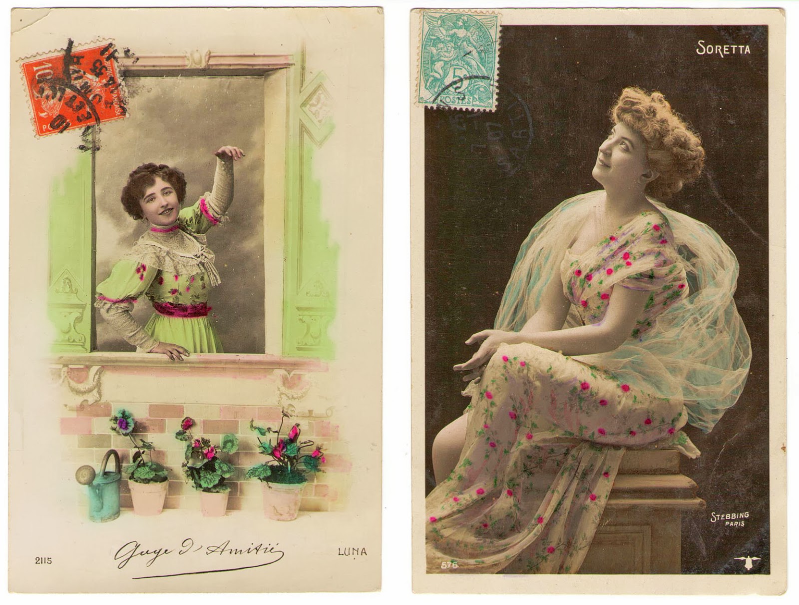
Most of these were actually mailed, and have illegible postmarks on their one-cent stamps. The messages are necessarily brief, and always make me wonder about the things that were left unwritten.

On a greeting sent to Miss Amy Beaumont in Portal, North Dakota, Nov. 1910:

·        Hello There – I am healing good. It is cold enough. Jo Sherman home. I have not been up that way all summer. I suppose everything is at the same. From a Friend, Albert Petersen


On a Christmas card to Miss Mabel Buchholtz in Bloomington, Illinois, Dec 21, 1921:

·        Merry Xmas and Happy New Year, From Miss Eva Tansley, Melvin Ill. (Write Soon!)

 
On a greeting sent to Miss Clara Vaughn of Helena, Montana, Jul 14, 1911:

·        Dear Clara, We rec’d a “Star” containing your speech and gave you credit for sending it. We are proud of your success. The babies are having measles, Miriam just over it and Oakley D just taking it. Where will you teach this fall? – Edith Lutes

 
Other cards must have been simply handed to the recipient, because there is no address or stamp. Simple messages are written in pencil:

·        From Grandma Robbing to Esther – Jan 1, 1912
 ·        To Carl from Mayme on his 26th birthday 1914. Wish you a Happy Birthday.

 
I just have two of these beautifully colored French postcards.


Finally, the star of the collection – a nine-page foldout souvenir postcard set from Cuba.


The front (above) and back (below) covers of the postcard booklet. The postage stamp was removed at some point – no doubt extremely collectible in itself.


The sender dated her luncheon at the Country Club of Havana to Jan. 31, 1926, so I can date the postcards to the 1920s or earlier.

 
There are actually 18 images, since each card has pictures on both sides.

I treasure this view into the old Cuba that was “The Summerland of the World” according to the little blurb in the booklet; and where “gem-like Havana” could be reached via “a delightful sea-voyage of 5 ½ hours from Key West.”

 
So here I have provided actual, tangible proof that there is some benefit to cleaning your room once in a while. You might find something that you thought was lost forever.

 
Katrina


P.s. The postcards are now in a labeled box on a shelf. I’m not putting myself through that again.

Tuesday, December 4, 2012

Inspiration at the Museum

This past weekend offered the opportunity for free museum passes, so we went to the Phoenix Art Museum to see what was new since our last visit in September. We looked at some photos and a lot of southwestern paintings, but I purposely left the Fashion Gallery until the end, knowing I would be there for a long time. Once I got in there, I almost couldn’t leave.

The current fashion exhibit is “Modern Spirit – Fashion of the 1920s.” Where do I even begin to describe this incredible collection? The colors! Yes, the colors. Surprisingly subdued, the colors in the room were mostly earthtones. Rust, camel, salmon-peach, black, and ivory made up the majority. There were also a few dusky versions of jewel tones like jade and plum, and dark blue appeared once in evening wear and once in a suit. A brilliant scarlet red was the exception to all this restraint, and it stood out in several areas of the exhibit. 
Although no photos were allowed in the museum, many of the exhibit pieces are from the Arizona Costume Institute, and these images are from their online gallery.
1928 dresses
The textiles were utterly amazing. Each piece was dripping with embroidery, beading, ruffles, rhinestones, or sequins. Several of the dresses were covered with thousands of glass beads individually sewn onto silk tulle or lace. How does the fabric bear that weight? How does the garment survive 90 years?
Three evening dresses by Gabrielle "Coco" Chanel. 1928, 1925, 1925.

One of the most luxurious-looking effects was the voluminous, gathered and rolled velvet collars of the evening coats, which were shaped very much like the Poiret cocoon coat. Even the velvet was embellished with beads and embroidery, and in one case, fur.
Folkwear Pattern 503, The Poiret Cocoon Coat. Source

I could go on and on, but without photos, I feel I can’t really do justice to the other pieces.

I will leave you with the last one that I do have a picture of, which was the simplest design, and also my favorite. It’s a Vionnet, of red silk crepe chiffon. The narrow silver edging is a lamé binding. For the sewists reading this, can you imagine trying to stitch a long strip of lamé to a fluttery, tissue-thin expanse of silk, on the bias, without snagging, tearing, shifting, or even creating the tiniest hole?
The epitome of elegance
A history of Madeleine Vionnet and her design techniques that we still use today is here. Also, Coletterie did a nice writeup on Vionnet here.

I was very inspired by my visit. I won't be sewing up any 20s-style evening gowns, but it certainly boosted my creativity.

What has been your source of creative inspiration lately?

Katrina


all photos from the Arizona Costume Institute, http://www.arizonacostumeinstitute.com/ACI/The_Collection.html


Monday, September 3, 2012

We Call It PAM


Are you having a wonderful Labor Day? We are having another quiet day at home, mostly avoiding the extreme heat and humidity.
The clouds are so lovely, but the humidity adds to a seriously uncomfortable heat index.

Yesterday we went to the Phoenix Art Museum – the PAM! – to take advantage of someone else’s air conditioning for once. There are always good reasons to go to an art museum: the changing exhibits, the multitude of different art forms, and creative inspiration are some of my reasons. The PAM also has nice gardens and a good restaurant. It all makes for an excellent afternoon or weekend activity.

source
 
I just discovered another wonderful thing about the museum, and that is that there are several ways to get in free. When I decided to change my economic status from “retired” to "unemployed” (facing the fact that my nest egg was nearly gone), I realized that I would have to entertain myself more cheaply than I ever thought possible. I sadly cancelled all my subscriptions and memberships and gave up my more costly activities, and became an aficionado of things that are free. A free entrance to the museum is a big win for me!

As always, I enjoyed something new and unexpected. One of the smallest exhibits was called The Politics of Place, Latin American Photography, Past & Present. Works by sixteen artists depict revolution and violence, decay and corruption, as well as work, faith, and humor. The piece that I found most interesting and beautiful was Requiem NN by Juan Manuel Echavarria.
source
NN stands for no name, for the people killed in Colombian drug massacres and dumped in the Magdalena River. Some of the corpses are “rescued” by local people and given individual tombs, which are then decorated and cared for as if the deceased were family members. These are the tombs that Echavarria photographed.

The magic of this piece is in the lenticular photos. They look like one thing when you approach straight on, and they change to another image when you move to one side or the other. Here’s a link to Echavarria’s site where you can watch a simulation of the effect. I think it was an incredibly effective way to draw viewers to the piece and get them to stand there long enough for the idea of all the lost, nameless dead to really sink in.
 

Photos were not allowed in most of the exhibits inside the museum, but I took a few shots in the outdoor sculpture garden. 
Tumbling Woman, Eric Fischl

Five Dancing Figures, Magdalena Abakanowicz

We ended our visit with a delicious lunch in the museum café, and headed home feeling quite cultured and sophisticated.


Here are some ways to see the Phoenix Art Museum for free:
  • On certain Wednesdays and Fridays they have free admission in the evenings. See the schedule here.
  • If you have a Phoenix Library card, you can get a seven-day Culture Pass for free museum admission for two people. See here for requirements.
  • If you have a Bank of America card you can get one free admission to each of several area museums (in several states) for free, every month. See here for all US locations and monthly schedule.
  • And finally, many local employers offer free or discounted access to museums, gardens, and zoos as part of their benefit package.

If you live elsewhere, this should at least give you some ideas of how you might get free admission to your local museums.

Katrina

Wednesday, August 22, 2012

Greetings

My inventory of handmade greeting cards was running low in the category of “masculine,” at least in the opinion of the male half of our household. I decided to make a new supply of cards, focusing on masculine themes and colors, rather than my usual florals and glitter and pinks and purples.
This is my kind of card: girls, flowers, butterflies, pink, lavender, and yellow.

I actually had to force myself to pick up the unused colors in my paint box: tangerine, rust, brown, olive, black. Once I’d covered a few sheets of paper with splashes of these unfamiliar hues, I added a few random dollops of “my” colors.


I got out some rubber stamps and stamped over the paint. Astronomy, zebras, antique hardware, old cars; those all seem okay for men’s greeting cards.


After some matting and collaging and more stamping I had a good two dozen manly cards in the orange, green, and brown colors.

I decided some pink therapy was in order, so I tried out some of my pearl acrylics in lovely colors like Cameo, Wisteria, and Cranberry.
Next came the pretty stamps: birds and flowers and ladies and happy children. It was interesting to see how different the stamped images appeared, depending on the colors of my paint on the background paper.
After cutting out the stamped images and layering them, I put together almost 30 more cards.


All together, I ended up with an even more lopsided card inventory (now totaling approximately 300 cards for women and 24 cards for men), and I haven’t yet gotten confirmation from the Piemaker on whether he considers my new “masculine” collection acceptable for him to send or for his friends to receive.
Anyway it was fun to mess around with paints again, and a good exercise to use a few new colors.
Katrina

Monday, June 25, 2012

The Not-So-Big Reveal

The reorganization is finished and although the sewing/craft room is clean and fairly neat, it isn’t something you’d see on HGTV or a design magazine. I left the walls white, because although I love color to the point of an unhealthy obsession, I need a relatively blank background on which to do my color “thinking.” I didn’t buy any new furniture, so the skinny shelves meant for books are now holding rolls of fabric and stacking supply boxes, and my dresser from 1974 contains paper, pens, and bookbinding supplies. Still, I think it is an improvement.  

The good news is that everything is very clean. The carpets look and smell better, at least temporarily. I cleaned the windows, walls, shelves, and everything else as I was moving things around, so there had better not be a speck of dust in there.
The better news is that I accomplished my goal of dividing the room between sewing supplies and art supplies. The only exceptions are the dressforms, which move around as needed.

The best news is that I took three truckloads of craft supplies and small furniture to various donation centers. This freed up some space, but not much, as you will see.
The sewing table looks HUGE now that I have the piles of fabric and pending projects put away. I can even open the shutters, although not for very long, since the light will fade fabrics in no time.


I finally have all my books and patterns in one place! All the notions, linings, interfacings, and various cotton fabric types have their own shelves. The larger fabric collections are still in plastic bins on the floor.

The much-reduced paper and paint collection is better organized but still takes up almost one whole side of the room. Again using only what I already had, I’ve made extensive use of rolling carts on the floor in addition to the dresser drawers and various types of stacking bins. The big blank space on the wall is waiting for a cork board.

The last section is a no-man’s-land between the door and the closet. Here’s my 35-year-old stereo cabinet with what must be the last surviving TV/VCR combo so I can watch my yoga tapes. I put the ironing supplies here as well.


I admit that I did slack off in a few areas. For example, I did not sort through my thousands of collage paper bits as I was transferring them into a drawer. Also, the closet is still a bit of a dumping ground for the things that just don’t fit anywhere else, like all the pre-digital camera equipment, a big basket of toys, and empty boxes I might want to use again (hoarder alert!). And let’s not forget the queen-size airbed, my sole concession to the fact that this room is also a guest room. Imagine the poor guest who has to lie down in this place and risk bashing his or her head on so many hard corners and sharp poky things.

And so, the final result does resemble my “reorg chart” (thanks Lilly Forever for that hilarious reference). The new setup will certainly make it easier to find what I need and I should be able to handle some of the larger projects without having to haul them around the house looking for a big enough table.
Now I think I’ll just leave it alone for a while. It’s too nice to mess up!

Katrina


Tuesday, May 22, 2012

My Version of an Eclipse

Thank you so much for your well wishes! I am starting to feel a bit better. The new medication is making me very sleepy, but at least I'm catching up on my rest.

As you know, I generally avoid the sun. If I’m outside, I’m wearing big dark glasses and a hat, and running for the shady side of the house. So in spite of fond memories of making pinhole viewers in primary school, I wasn’t that interested in viewing Sunday’s eclipse directly. Still, I couldn’t resist going out to see what kind of light and shade patterns might be created by the solar phenomenon.

I was well rewarded!
 Thousands of crescent shapes were projected onto every surface in the neighborhood, as though the sun were shining through a wall of coke bottles.

Where the light filtered through branches, it gave a lovely Japanese brushstroke effect.
In some places it looked like a ghostly crowd of people waiting for something. 
Drama!
Did you get a chance to see the eclipse?
Katrina

Monday, May 7, 2012

Gifts: Fun Recycled Crafts on Etsy

Last week my friend gave me the cutest little notebook. (I was going to try to avoid the words "cute" and "awesome", but I can't do it.) The covers are made from recycled cardboard boxes and the writing paper is also recycled.
 A perfect slogan for me

The giver of the gift said she found all sorts of amazing things from this Etsy seller, so of course I had to go investigate Ivy Lane Designs.
Crayon duckies!

Wow! The owner of the shop is named Merrill, and she has so many amazing and cute ideas. She recycles everything! Crayons, cereal boxes, album covers, game boards, matchboxes, music sheets, maps, flashcards, and the list just goes on. I think it would be easy to find a little gift for anyone and everyone on your list at this shop.
I LOVE these bee boxes.

 Merrill has such a great eye for striking graphics,

 Pop icons,
And pithy quotes.

As you know, I have a real love for crafting with recycled materials, and it’s wonderful to see these shop items that are nicely made and seem to be selling very well. Awesome! Let’s support Merrill and all the other crafters who are keeping reusable stuff out of the landfills!

Katrina

Wednesday, May 2, 2012

A 1937 Fashion Illustration Course

If you’re a thrift store devotee and habitual browser like I am, you know that some days you don’t find a single thing worth the price tag, other days you find a rare treasure, and occasionally you pick up something that looks interesting but you don’t realize how interesting until you get it home.


I found this book last year when I was digging through the shelves at one of the local Goodwill stores. The $4.99 price seemed steep for a paperback in poor condition: it’s stained, dogeared, the pages have darkened, and the back cover is missing. But flipping through it, I fell in love with the elegant line drawings.

Later, with the leisure to look at it more closely, I discovered it was published in 1937. There are very few photos, as it is essentially a technical guide to fashion illustration, meant for industry artists-in-training. The only illustrations are by the author.

One of the most interesting comments:
Drawing the Fashion Figure does not include reproductions of contemporary illustration because styles are so ephemeral that the book would be outdated within a few months after publication if it contained such material.
How true, since the business of fashion is based on changing it drastically every couple of months so that consumers must buy new things. And yet how funny is it that any art, history, or fashion student of today would snap this book up in an instant and treasure the drawings of 75-year-old fashions? Could Ruth Conerly have known that we would enjoy her drawings so many decades later?

She was an artist even as a child, but family problems led to extreme poverty and she worked hard to get an education and then to find work. Eventually she became a successful and well-known commercial artist for everything from fashion to war bonds.


The book is meant to be a text for a university course. “Laura Wilkinson, Columbia University” is handwritten on the cover. I wonder what Miss Wilkinson’s major was, and whether she had an interesting career after graduating! Although it’s only 83 pages, the booklet seems to contain all of the information you would need to draw figures. Of course, you’d also need some artistic talent to start with!

Tone, light, balance, proportion, and perspective are explained.


The necessary materials are listed.


The majority of the book is comprised of examples. The lovely, deceptively simple drawings range from elegant, to risqué, to sporty, with a bit of cute!
I see a sly humor at work here. The facial expressions are priceless.


While Conerly may have been mostly forgotten elsewhere, Texas historians are fond of her poverty-to-success story.
In addition, Conerly was painter, and one of her most famous paintings is of Alamo hero Colonel William B. Travis.

Here’s more info if you’re interested:

A few images from another Ruth Conerly book, Home Course in Fashion Art can be found here
Info about a biography of Ruth Conerly written by her daughter.
A short bio from the Texas State Historical Association.


Have you found any thrift store treasures recently?

Katrina